

Kozi is a brand created as part of my master's degree in Digital Design Management (D2M). The objective of this project was to create a brand from scratch, promote it on social networks and launch a website with a variety of different products. On this page I go through the different elements of the process of designing the brand and the different products.
Visit the website to find out more!
Brand name
The name "Kozi" comes from an expression I use with some of my French friends from college. When we feel comfortable and settled in a welcoming space, we say "je suis toute cozy", which means "I feel good". Although it doesn't sound entirely unique, I wanted to evoke the pronunciation of "cozy" in the brand name (which is pronounced in a rather cute way, hence the "k" and "i" at the end), and I liked the reference to my own story and the sense of wellbeing I'm trying to convey.
Moodboard

For the Kozi brand, I was inspired by my own experience of moving, where I felt very distant from my family and 'the old version' of myself. I wanted the brand to incorporate and reflect elements that made me feel more comfortable, in the city as well as in my skin. Whether it's a warm cup of tea or that warm feeling of being inside when it's cold outside ... there's nothing better than being in your corner and saying "I'm happy to be here, right now."
I also really like astrology, and I wanted to reflect my own spiritual journey in Kozi's products. By focusing on the world around us as part of a whole Universe that we share with countless galaxies, I felt much more connected to where I was, the people around me, and myself. This idea that everything is connected in the sky under which we all live was an (abstract) but beautiful thought for me, which made me feel immediately safe, wherever I was. That's why I added stars, little nods to my more spiritual side in the Kozi products and illustrations.
Finally, I also added elements such as art and lavender, as they are very therapeutic for most people, including me. The handcrafted, childlike quality of the moodboard designs connects with the brand's aim to reconnect you with your 'inner child'. They evoke memories of childhood, the fun times spent with your parents or friends drawing around a table, and the smell of lavender from the little bag on your wool jumpers... In my mind, all these elements create a comforting feeling - and this is what I wanted to bring together to build the world of Kozi.
Logo Design
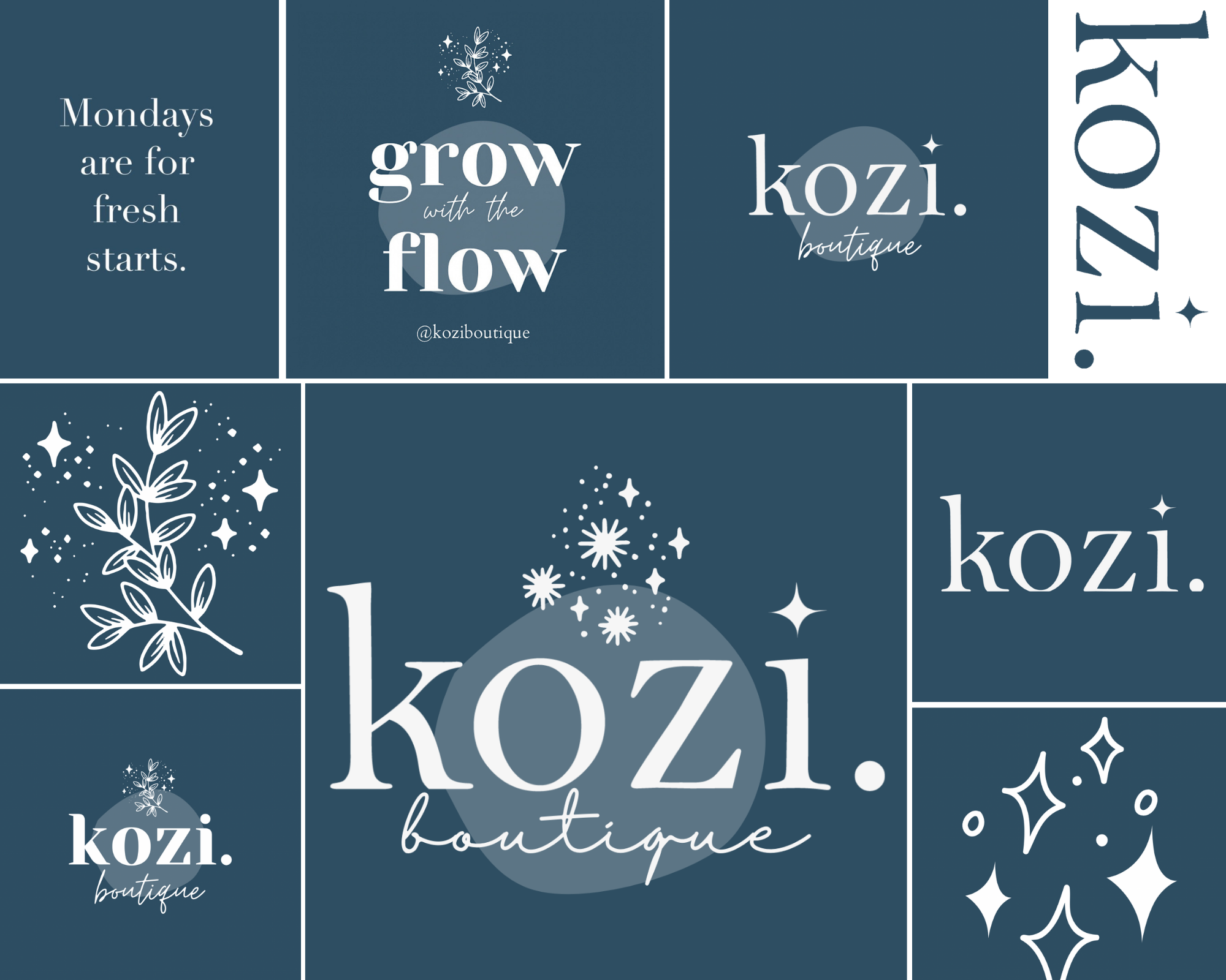
To design the Kozi logo, I was inspired by several boutiques via Instagram and my personal experiences, including DreamyMoons, Coco Nomad, Take me to Annecy and Coco la Fée. I loved the magical feel Annie Tarasova brought to her DreamyMoons logo, but I also wanted to keep the look slightly minimal to appeal to young adults seeking independence. The logo had to reflect comfort and friendliness, while remaining age-appropriate for the target market. I tried to handwrite the brand name, as Coco la Fée does on its website and most of its products; but after some thought, I decided to use a Serif font to give the brand a more sophisticated look. Despite this 'sophistication', the font is still reminiscent of the comfort of reading a good book in the warmth, a magical feeling that I wanted to emphasise with the little star above the 'i'.
I decided to keep the idea of the universe and the stars as a motif in my brand. This is also why I chose blue as a recurring theme in the logo, on the website and in the aesthetic of Kozi in general. Even though blue is reminiscent of empty space or even the 'blues', it can be filled with all sorts of stars and comforting objects to deal with those negative feelings. I initially opted for a navy blue, but quickly changed my mind for the web representation of the brand. I opted for a lighter blue to bring a splash of colour to the website and Instagram page, and which tied in better with the colourful posters/illustrations (which were already designed).

Le ‘nouveau bleu’
Designing the Products
The project required the design and creation of 3 different product variations, as well as a poster, perfume, tote bag, and a 'surprise' product. These had to be ready to present at the ephemeral market on 15/12/2021.
I decided to include all these items in a 'first collection' which I call 'Grow Into Your Home'. This phrase is similar to the phrase 'come into own', which means "Of a person, reaching a new level of maturity, independence or success. Often said of young adults." (reference) In my head, this phrase makes perfect sense with the identity and purpose of the brand. The reason I changed the phrase slightly is to show that reaching this new level of independence takes time, patience and attention - hence the word 'grow'. I've also replaced 'own' with 'home', which emphasises the mission of this first collection: to make girls feel good about themselves.

Hoodie
For the hoodie, I wanted to focus on a minimal design, with a small message on the front right side. This idea came from a number of different jumper designs I found while looking for inspiration (see inspiration chart below). Personally, I prefer my jumpers to be minimal as they can go with most outfits and add an element of sophistication that I want to associate with the brand. I say 'sophistication,' because while I want the brand to connect us to our 'inner child', I also want it to act as a 'mother figure' of sorts. This will help young girls who need support while seeking independence. The 'sophisticated' or 'clean' aspect of the brand therefore means that girls can not only feel inspired by what they use or wear, but they can also use it easily in their everyday lives, while still being proud of what the brand means to them.

I decided to use a dark blue for most of the Kozi products, including the hoodie. For this one, I opted for a small handmade design that says "wearable hugs". This little phrase is a nod to the maternal aspect I'm trying to evoke in the brand identity. A small reassuring message to encourage and comfort those who wear the sweater during their day.
On the back, I wanted to add a more striking design, which links the sweatshirt and the T-shirt (which has the same illustration on the back). It is a large sun, evoking a feeling of cheerfulness, power and therefore encouragement. The illustration also incorporates small childlike accents, reminiscent of the rest of the Kozi collection and the small illustrations scattered around the designs.


T-shirt
This brings us to the design of the t-shirt. I wanted to incorporate the Kozi logo on one of the garments, and I thought the white t-shirt would be the most appropriate. White t-shirts are a wardrobe essential, a concept that works well with the simplicity of the logo. The logo is quite small and classic, making the white t-shirt a timeless piece that can be worn with almost any outfit.
On the back, I used the sun illustration to add a creative touch to the t-shirt. Again, this illustration refers to the collection's goal of empowering the wearer. A bold sun on the back of the item does this perfectly, and evokes a sense of joy.


Mug
When I'm looking for comfort, one of the first things I do is make myself a cup of tea. I knew I wanted to include a mug in the Kozi collection, as many people associate it with the warm feeling I want to convey through my brand.
Herbal teas are generally very comforting, which I think is due to the nature of the product. It's literally a cup of herbs soaked in boiling water! I loved this idea, and the fact that plants are associated with maintenance, patience, and cultivation. So I thought it would be interesting to highlight these ideas with little illustrations of plants on the mug. I hand-drew the plant illustrations and then edited them in Illustrator - but I was a bit worried that the message of friendliness and comfort would get lost in the design.
To avoid this, I added a little quote to the illustrations: 'Happiness blooms from within'. This quote not only plays on the illustrations of plants to create a feeling of comfort ('blooms'), but also on the pure happiness that many people feel when they drink something hot. A drink that we literally take inside us, and that makes us happy.
I decided to include the quote in the same font as the Kozi logo, not only to tie in with the brand identity, but also to contrast with the illustrations and add a bit of variety to the shapes (instead of handwriting it, which could have gotten lost in the illustrations). I also decided to add a starry background to bring back the theme of the stars while connecting the two facets of the brand - the 'roots' and the universe. The stars also evoke a sense of comfort and wonder, which, along with the plants, depicts the idea of flourishing at the heart of the quote. Finally, I decided to frame the illustration in a square to represent the idea of 'within'.

Posters
I wanted to put a unique spin on this product by creating a mini poster tailor-made for the client. For the ephemeral market, I framed an example of a poster I created for family friends. It was an idea that I received a lot of positive feedback on, so I thought it would be interesting to include it in the Kozi collection.
The idea behind these posters is that customers can have a piece of home wherever they are. The idea is that I offer the poster as a product on the website; customers can then specify the place(s)/monument(s) they would like to see represented on the poster. This can be an individual city or a combination of different places. The customer can also add any other specification they wish to add to the design, or if there is a particular monument they would like to see on the poster. These illustrations are made by hand before being framed (available in A4 size).
The posters are much more colourful than the rest of the product range. These colours depict a jovial look that customers may find comforting to look at. Although the posters do not use the brand’s colours, I try to incorporate the brand motifs, including the starry sky and the whimsical plants in other products.
Examples of posters already produced:

Verneuil-en-Bourbonnais

Gannat, Prague, and Jenzat

Annecy
Tote bag
Next, the tote bag. I decided to keep this design quite simple by creating a logo for the "grow into your home" collection, so that one of my products could carry the name of the collection.
For this design I wanted to keep the same navy blue used for the hoodie to create consistency between the products. The bold letters are meant to reflect the comfort of the brand, so the emphasis is on softer shapes for the words 'grow' and 'home'. However, I used the same font as the logo for 'into your' to add a bit of visual contrast, while still linking to the brand logo. This was also the purpose of the little stars in the background, which I wanted to use as a motif for all the products.


Perfume
For the creation of the perfume 'Miss Kozi', I already had the idea of incorporating lavender in the aroma, as it was one of the bases of inspiration for Kozi.
As we didn't have any lavender essential oil during the practical course, I decided to do my own research by consulting a family friend who sells essential oils at Nature & Découvertes. I wanted to know if she had any good ideas for scents that would combine well with lavender. I explained to her that I wanted something comforting but also encouraging for young girls, so I needed to balance the floral and woody scent of lavender to create something a bit more dynamic. She recommended patchouli, which has a slightly 'spicy' smell and is used in many lavender-based perfume recipes. After trying the combination, I decided to buy a bottle and create the perfume at home.
The customisation of the bottle was quite complicated. The basic idea was to print the 'Kozi' logo on the bottle, but as it was too small, this was not an option in screen printing. So I tried to draw it by hand, which was more complicated than I expected! I know now that next time, or later if I continue to create Kozi products, I will create labels for the perfume to make the finish neater.

Greeting cards (surprise product)
This last product is the 'surprise' product - custom-made greeting cards! The concept is similar to the posters, but for greeting cards. One of the things I love doing for others is creating cards for special occasions, and spending time creating a card for them. I thought this would be another great product idea, reminiscent of the sense of belonging I try to share through the Kozi brand. The greeting cards are a nice little conclusion to the 'Grow Into Your Home' collection, as they show that once you feel good about yourself, you can share that happiness with others. So I created three examples of cards to display for the market.
The design of the cards is quite simple. I paint the letters in watercolour, a practice that reminds me of my childhood and that refers to the idea of the "inner child" that Kozi is trying to evoke. I also added the little signature stars inside the letters, alluding to the sky and the idea of connection.
